Rakkar Digital
Rakkar delivers ultra-secure digital asset and crypto custody with full segregation and unparalleled agility in service.
Design System
launched


1.
Project Overview
Rakkar Digital Project / Aleph Labs Agency


My Role
Product Designer
UI Direction / Interaction Design
Scope
Team
Poon Wen Ang
• Design Director
Henry Nguyen
• Design Lead / Ops
Hieu Doan
• Product Designer
Story
A team of 4 people, 1 Director and 3 Designers, on a mission to migrate the crypto custody platform's application designs to a more efficient & effective design direction that better represents Rakkar's brand positioning, along with a design system that improves communication with developers.
Location & Time
Remote / Home Office
11/2022 - 3/2023

Web App
Design Mockup





Design System
Components Showcase
Mobile App
Splash Screen Animation

Design System
Illustration
Design System
Illustration

Design System
Illustration

Design System
Illustration


Mobile App
UI Samples
context
Get to know Rakkar,
an Institutional Digital Assets Custodian.
Founded in the crypto "winter" of 2022, Rakkar focused on building trust and transparency in safeguarding crypto assets for institutional clients. Crypto custody transparency has forever been a barrier for general clients, keeping the majority of users from being open to participate in this relatively new market. The collapse of FTX in 2022 - one of the world's biggest crypto exchanges back then, raised huge questions and concerns about how the leading brands in crypto are handling users' funds.
Rakkar, even though a very new comer, understood this pain-point thoroughly, and has been striving to eliminate those concerns by offering an open, intuitive and transparent service in safeguarding clients' assets - especially institutional ones.







Mobile App
UI Samples
In November 2022, under the supervision of Aleph Labs Vietnam, I joined the Rakkar project to help build the ecosystem's visual components, including Rakkar Web Application, Rakkar Mobile Application and Rakkar's Employee Portal.

challenges & objectives
There were a lot of cleaning to do before getting started on the mission.
challenge
Unstructured Designs
The previous designer handed off to me a "big mess". His design was built without proper communication with his clients, lack of a structural and systematic approach, and no understanding of the crypto field.
He also avoided most of the calls and refused to share the background of his work, making it a painful progress to collaborate with him.

challenge
Incompleted Design System
The importance of a design system was overlooked by the team, hence no proper effort was put into building such infrastructure. This resulted in an inconsistent visual language, low-quality design handoffs and a spontaneous working style of designers.
challenge
An upcoming UI rework
At a glance, the visual design of the entire ecosystem back then had an outdated look and feel. Our design director from Aleph, Poon Wen Ang, took a step to point it out with the clients, and suggested an overall visual direction rework.
A 2-week timeline was set, and newly came designers were expected to bring some fresh perspectives to the table.

Rakkar Web App
Account Page
Old

Rakkar Web App
Account Page
Old
• Project Objectives
Primary Objective
Deadline
2 weeks
Visual Concept Lead
Son Tran
Secondary Objective
Deadline
1 week after
Visual Design
Delivering a visual concept
for an ambitious team.
"The First-class Digital Asset Custodian"
Visual Objective
Rakkar
Visual Direction Requirement
The founders of Rakkar defined their service as "The First-class Digital Asset Custodian". After getting on a few calls with our clients to agree on the direction of the redesign campaign, we narrowed the requirements down to objectives:
Product' visual direction should resonate with the brand's established identity, i.e. Navy & Pink colors.
The outcome design should express the feeling of a "World-class" and "First-class" service.
The clients cannot afford any change in their branding identity.


Concept Exploration
The results
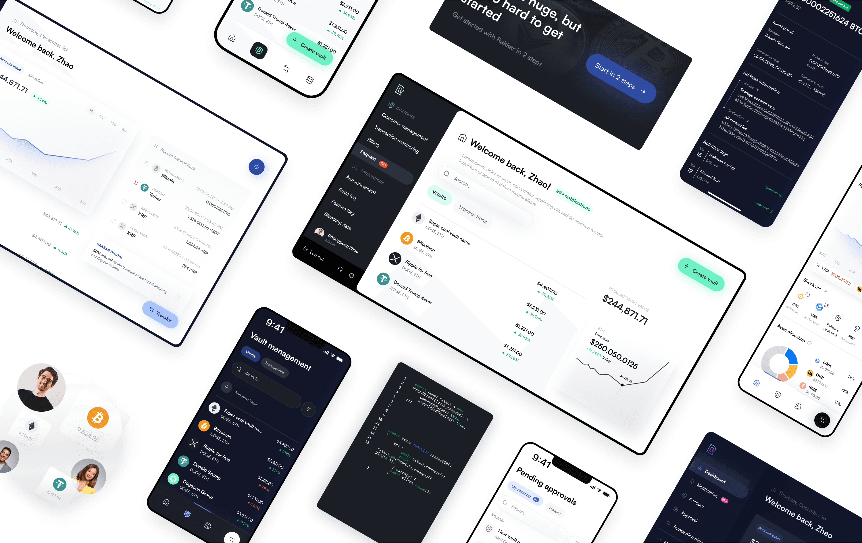
Put aside all of the previous designs, I worked with the team to build something new from scratch, starting with building mood-boards, inspirations, and imaginations.


Visual Direction
Moodboard Exploration

Visual Direction
Illustration Exploration
Visual Direction
UI Exploration
Design System
It's all about building the design foundation that is simple, yet scalable in the future.
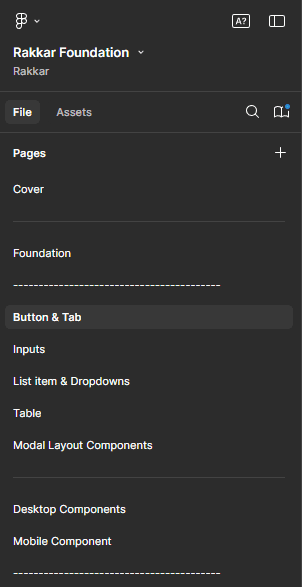
Design System
File Organization
The first steps towards
Consistency & Sustainability
Internally, the design team started to establish a new design system based on the new design language. It was quite a smooth operation since we've had experienced building design systems before. Starting with the foundations such as color palettes, typography, shadows,… we quickly moved on to building components like buttons, text fields, modals, dropdowns,… Everything is built with accessibility, sustainability and responsiveness in mind.
Our way of building design system was heavily influenced by Untitled UI, one of the most popular UI kit. Although, we did make some modifications to simplify our internal workflow, such as minimizing the number of pages and make it easier to memorize components' location, or labeling each component variant clearly to make them intuitive and accessible to new designers.

Design System
Component Variants

Design System
Component Variants
An improved
Development Experience
As designers, we strive to deliver an effortless experience for developers to navigate and meticulously inspect our designs. Apart from handing off a well-structured design system, we also provided developers with responsive designs, labeled layers, comprehensive user flows, and Design QA results. Everything was delivered on a dedicated file for developers, and every new update was communicated precisely to avoid conflicts between parties.
Design Quality
Responsiveness

Design Quality
Design Structure

Design Quality
Design Flows Hand Off
Interactions
An intuitive user experience is made with carefully crafted interaction details.
A part from delivering the new visual language and design system, it's our job to maintain the regular update sessions where we talked about our design decisions and how they impact the user flows of new features.
An intuitive
QR login experience
Rakkar utilized mobile devices' security system to login on their web app. User will have to use their fingerprint/face ID or passcode to login on their mobile, and authorize a website session by scanning a QR code. For some apps, this feature is not directly visible, forcing users to look for it without any instructions.
To avoid creating frictions and frustrations, I added an instruction carousel, which acted as an illustrated guide to users, while also made the screen look less blank and boring.
Web App
Login Screen
Redesigned
Create familiarity with the
Use of Animations
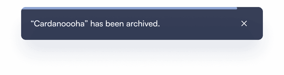
To help users to instantly recognize common patterns, we worked with developers to implement micro animations across the system. For example, to view a list of "archived vaults", users can click on a dedicated "archives" button, where they'll see a "fade to left" animation, indicating another page is being introduced, while giving a hint on the location of the "back" button, which usually will be on the top left of the page.
Web App
Archived Vaults Animation
Redesigned
Crypto Staking
Not only for the Pros
Crypto Wallets back then offered very technical and unfriendly staking experience, where users can easily be overwhelmed by stats and specifications of stake pools. To tackle this issue, I worked with technical leads at Rakkar to introduce a simplified staking experience, where we focus on the practical benefit of staking — to earn more crypto with crypto.


Cardano Wallets
Staking
Others
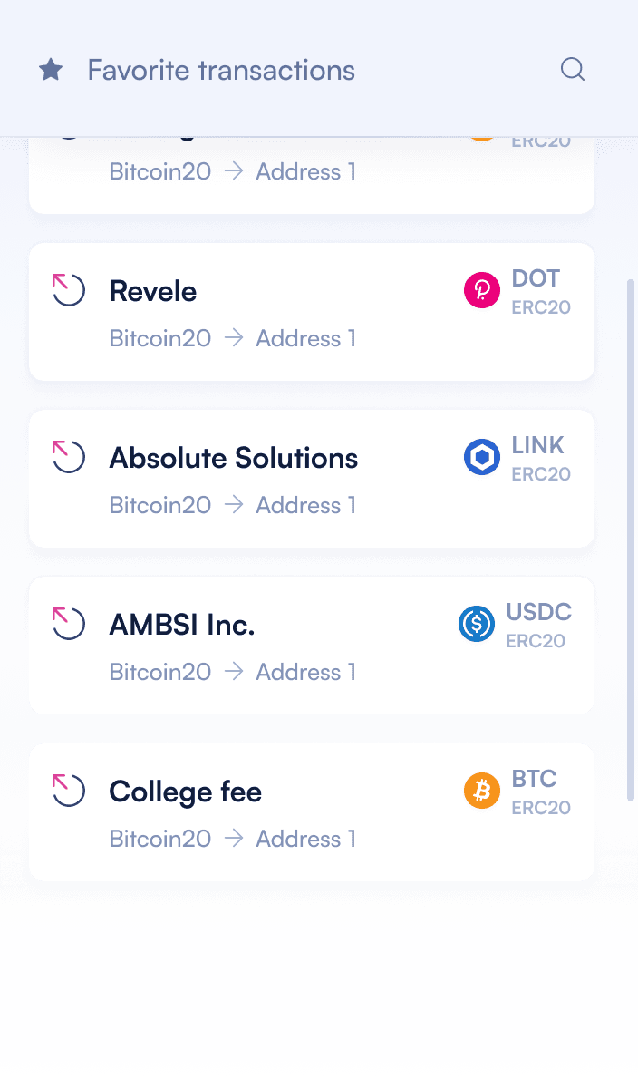
We redesigned the staking flow for Cardano to be as simple as opening a saving account on banking apps. While it's easy for non-tech users to start and benefit from staking, pro-tech users can also find options and customizations to help them optimize their stakes — like using regular crypto wallets.

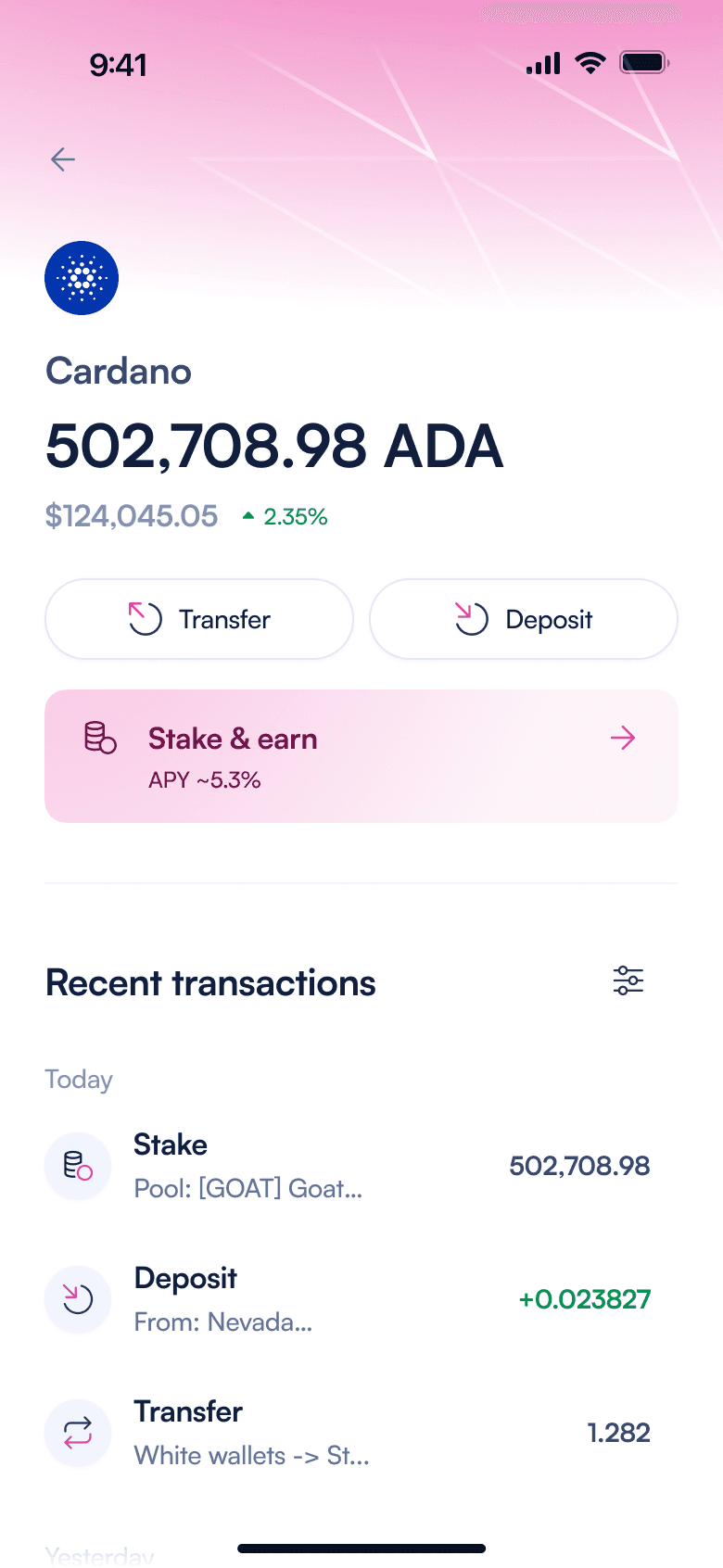


Mobile App
Cardano Staking
Redesigned
Information clarity
Enhanced with Illustrations
Rakkar implemented some creative features to enhance user experience and platform's transparency, thus, some new features might potentially confuse users by their novelty.
The Proof of Assets feature is one example, where I added illustrations for the report sorting options to further explain the idea and set up correct expectations before users actually download the reports.

Web App
Proof of Assets
Before

Web App
Proof of Assets
With Illustration
Final Design
Now this feels like crypto.
The feeling of
Something Different
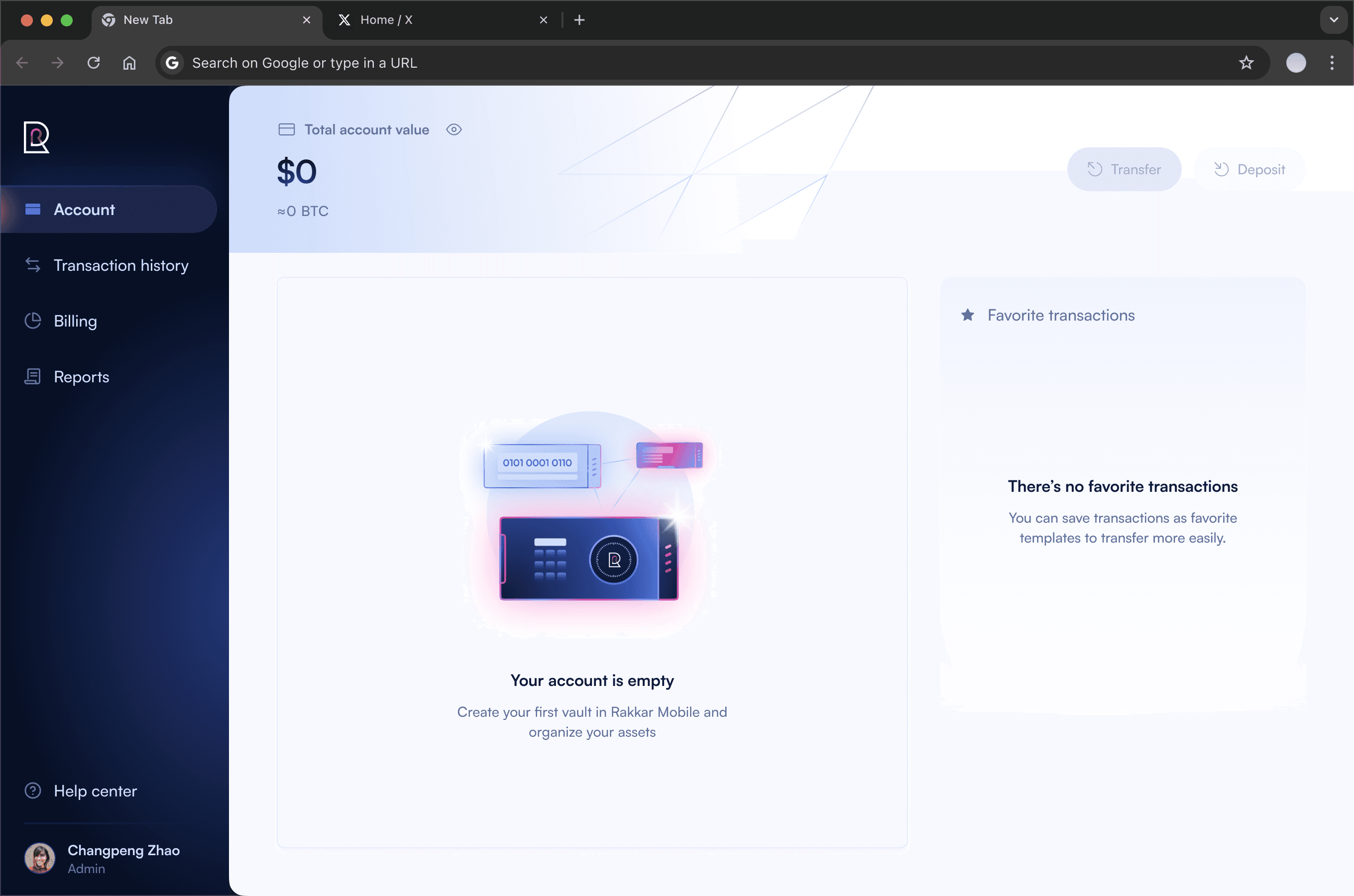
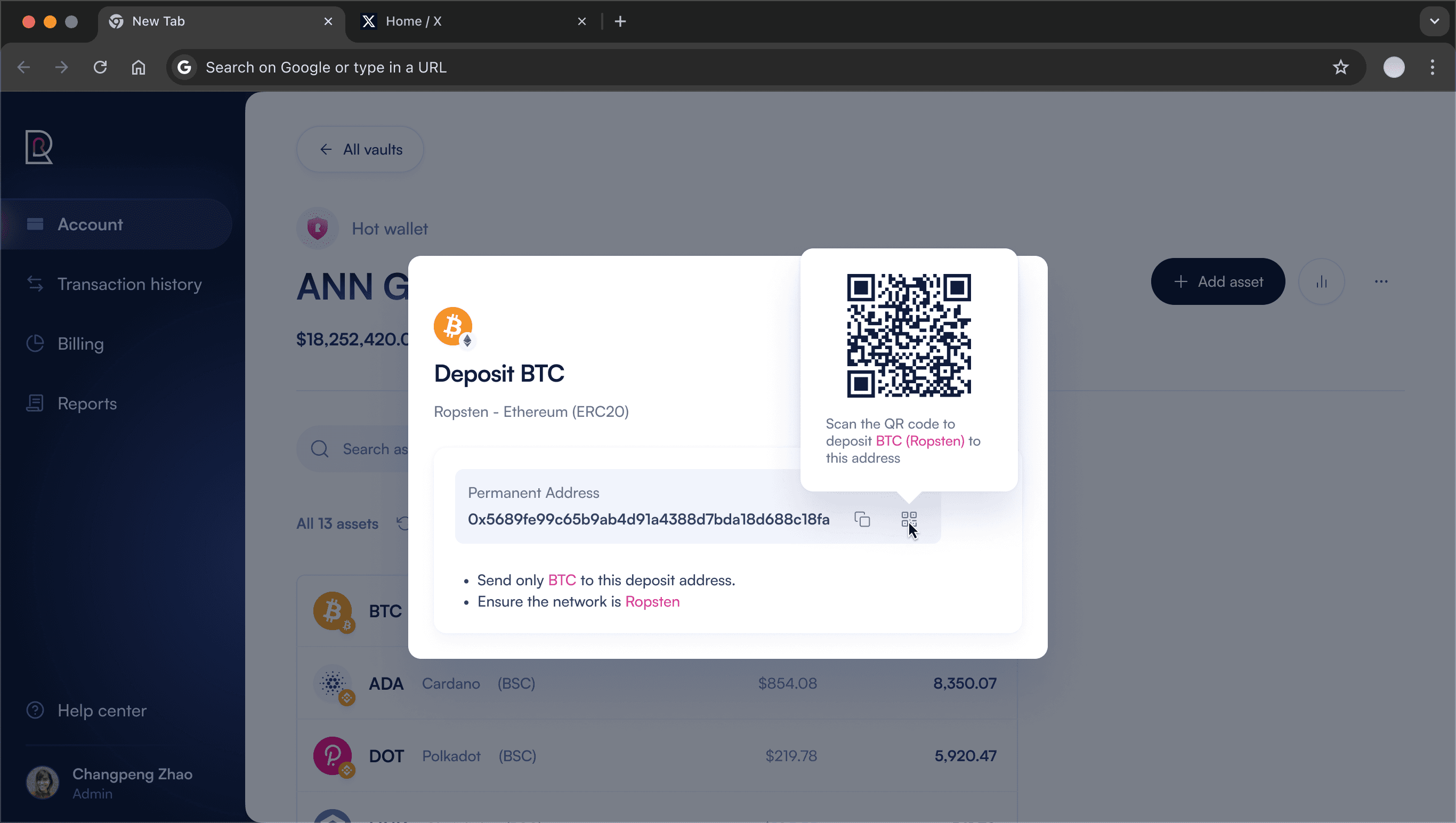
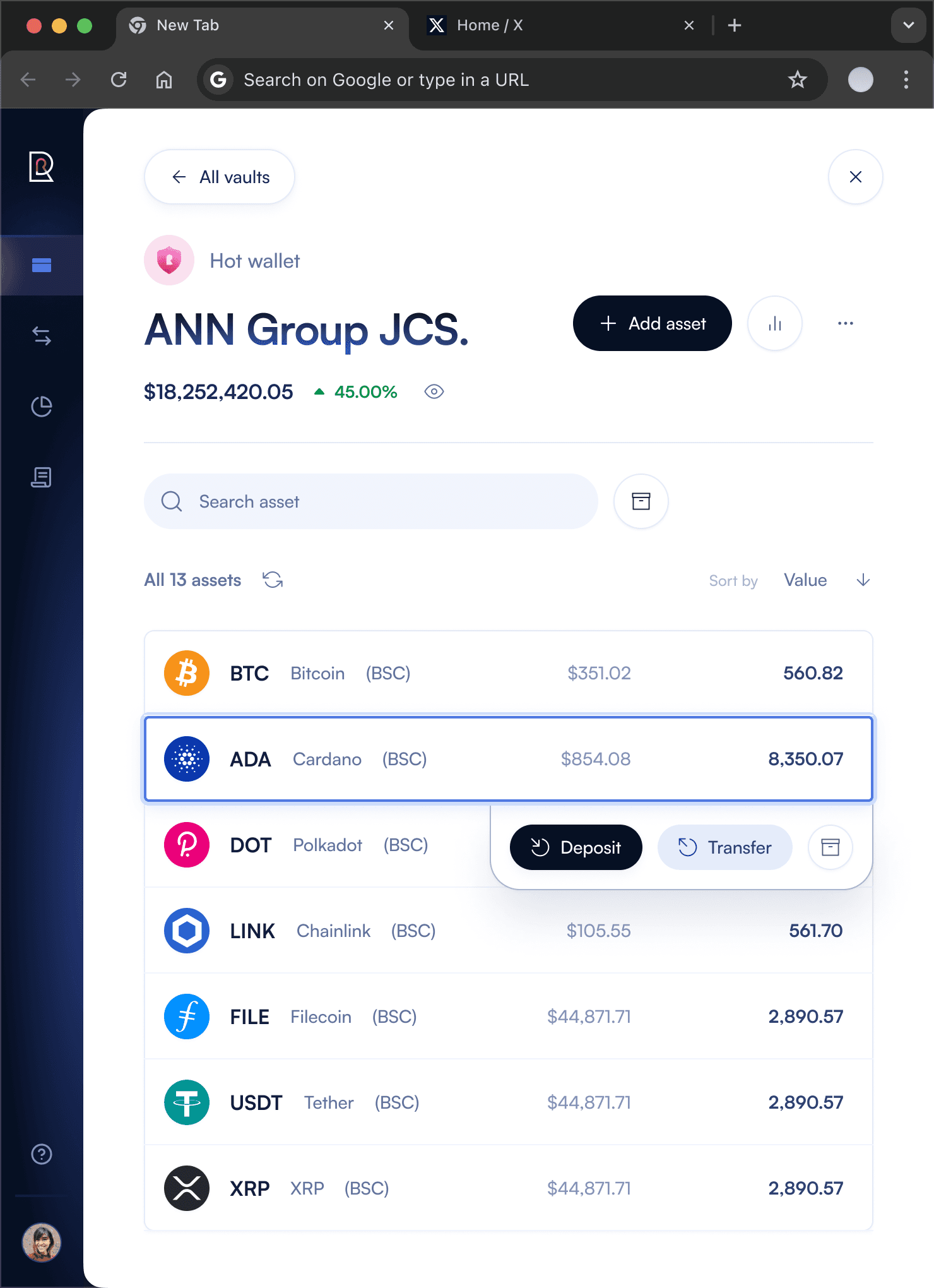
After a few weeks, I've worked with the design team to delivery a brand new look and feel to Rakkar's services, established a scalable design system, and improved the quality of the design assets.
Let's take a look at how the designs had changed. I'll leave it to you to assess the outcome of our work.
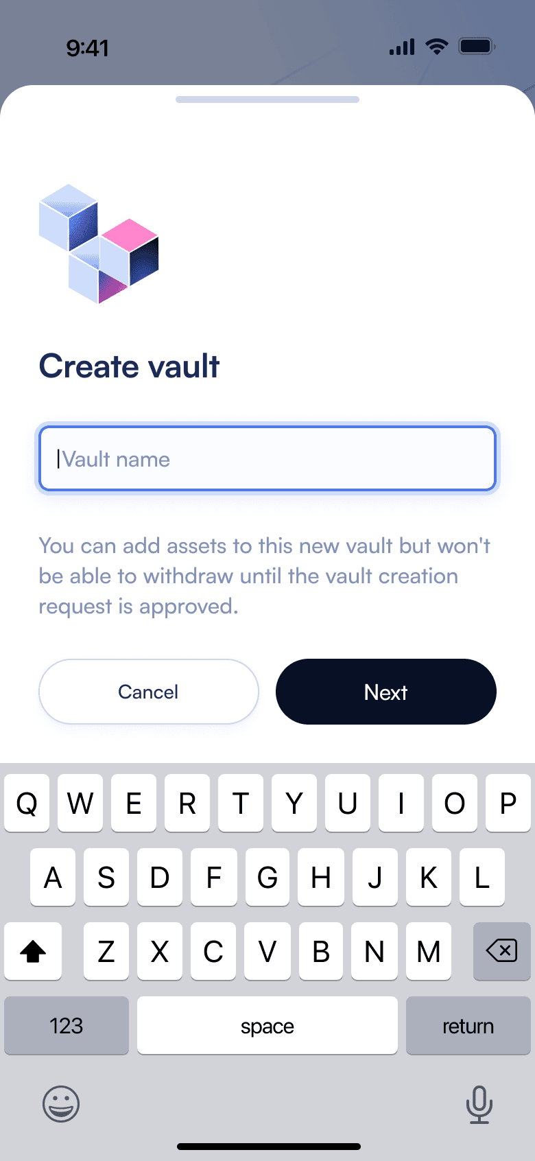
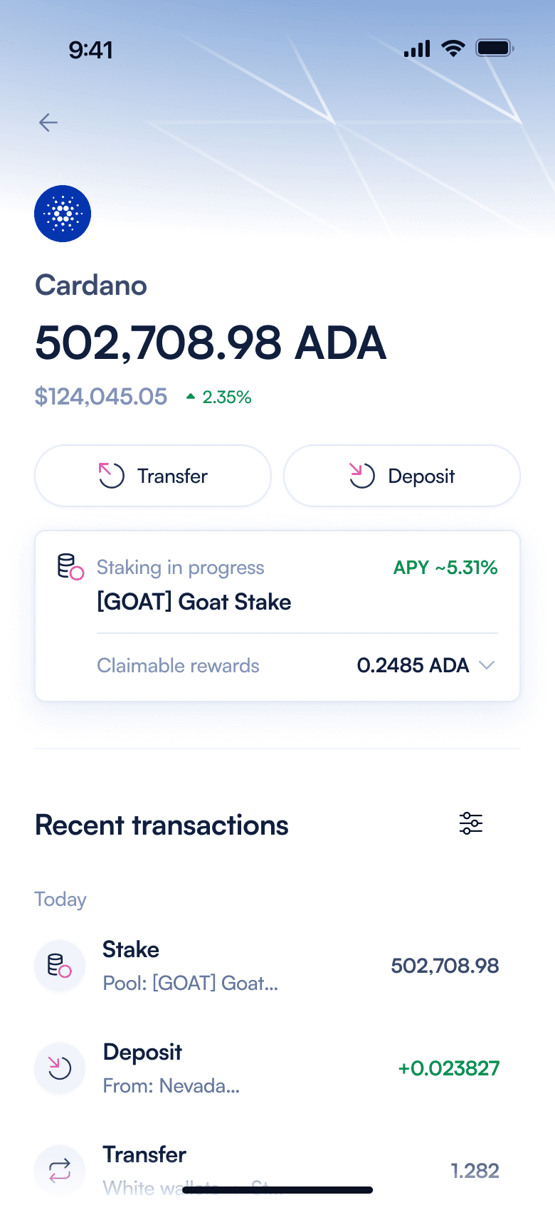
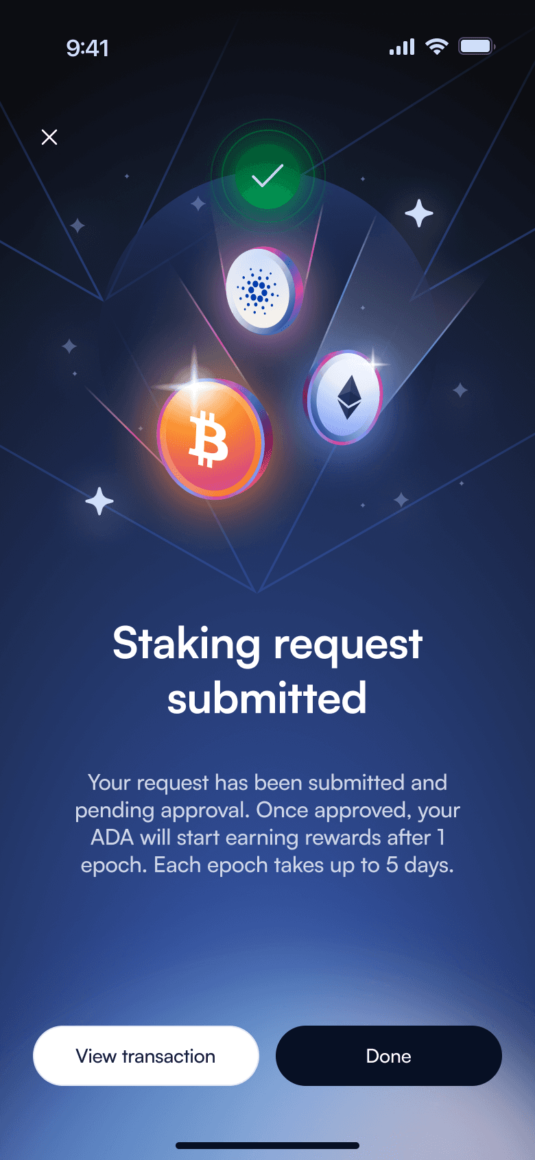
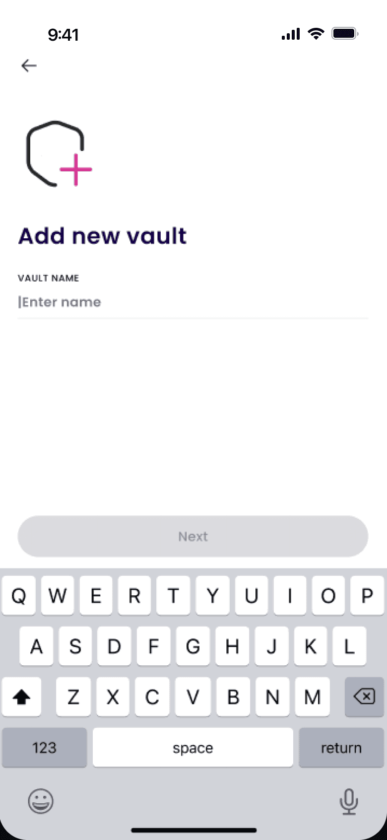
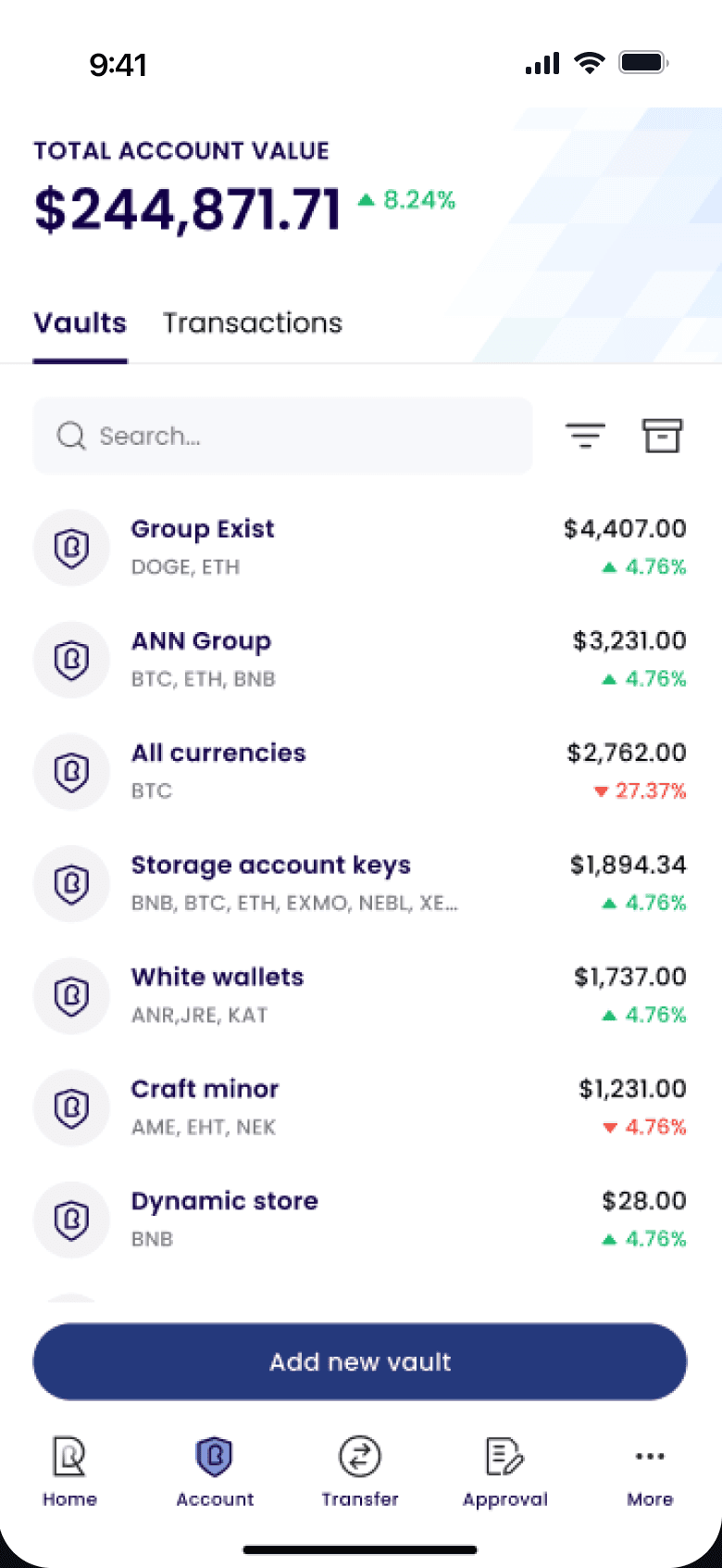
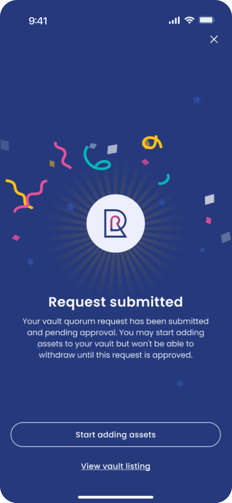
Mobile App
Before & After

Rakkar Digital
Final Design
Rakkar Digital
Final Design

Rakkar Digital
Final Design

Rakkar Digital
Final Design


Rakkar Digital
Mobile Design
The approach for
Usability Testing
When designing for Rakkar, we utilized the most common UX patterns to create a seamless experience even for new users. When it came to implementing uncommon flows, we organized user-testing sessions to gather feedback and address potential issues/improvements that can be made to optimize user experience.
Most of the times, our tested users provided positive feedback with no major issue over their experience.
Web App
Transfer Crypto Prototype
Retrospective
An interesting collaborative experience with Aleph Labs and Rakkar Digital.
The Result
The clients were happy with our design, and the quality of our work. We've definitely leveled up the overall design standard at Rakkar, and delivered beyond the initial expectation.
Thoughts by
Son Tran
There's always room for
Possible Improvements
Explore more into Visual Design
Looking back, I can't help but felt like we were too concentrated on one visual design option, aiming to perfecting every little details. Instead, we could've spent the time to get inspired with more design options, other than jumping straight to work on the actual design.
Communicate more with Developers
By then, our designs were being implemented by a 3rd party software company, which limited our opportunities to directly work with them. But, I guess if we were to actively initiate more conversations with them, we could've leveled up the design system to match developers' end, and enhanced synchronization in the engineering process.
Rakkar Digital
Next Project
KnowledgeHut is a global ed-tech company that offers professional training and certification courses
